Padrecito Mexican Restaurant
overview
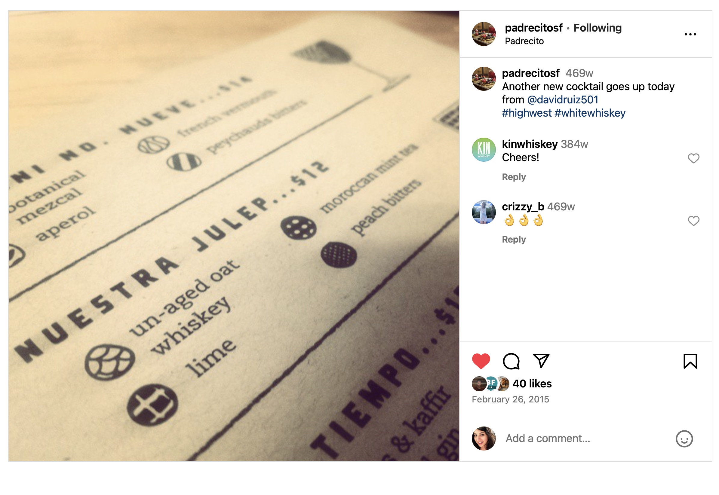
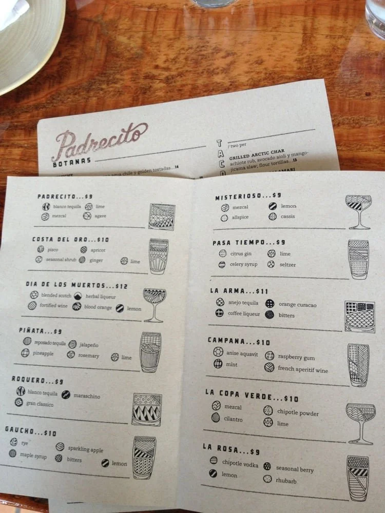
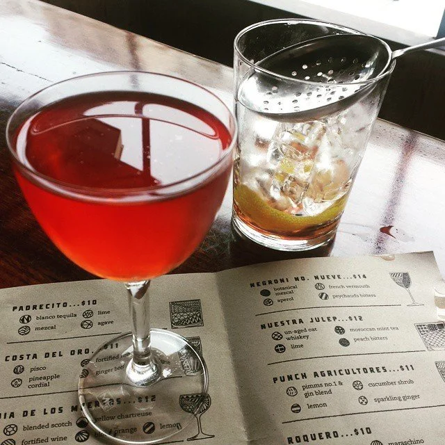
Weeks before neighborhood bar and restaurant Padrecito was set to open in San Francisco’s Cole Valley neighborhood, they were still in need of a cocktail menu design. Bar manager David Ruiz needed a design with some tight constraints:
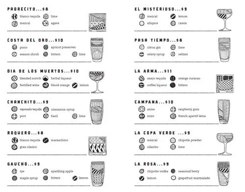
Design needed to quickly convey the style of drink (long, on the rocks, neat) as well as the cool ingredients within to the customer.
Design must be black and white so they could print up to date menus on their regular printer.
Design must be evergreen, allowing them to change cocktail ingredients or even add entirely new cocktails as needed, without requiring more illustrations.
So the solution needed was a full design language, one that would allow David and his talented crew to make substitutions and create new cocktails on the fly, while still conveying an accurate visual representation of the cocktail and ingredients. In addition to these constraints, I had three days to complete the designs, as I was set to leave the country for four months
services
Menu Design
Creative Direction
Design Language
ideation stage
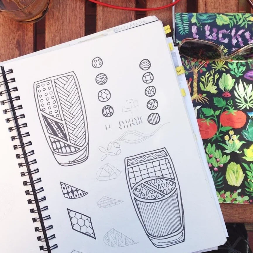
Taking a cue from my existing cocktail diagrams, I quickly mocked up a version with various graphic line and dot drawings to stand in for different ingredients, instead of relying on color and labels in my usual work. Each cocktail would come with a small, easy to read “map key” indicating what each of those designs represented.
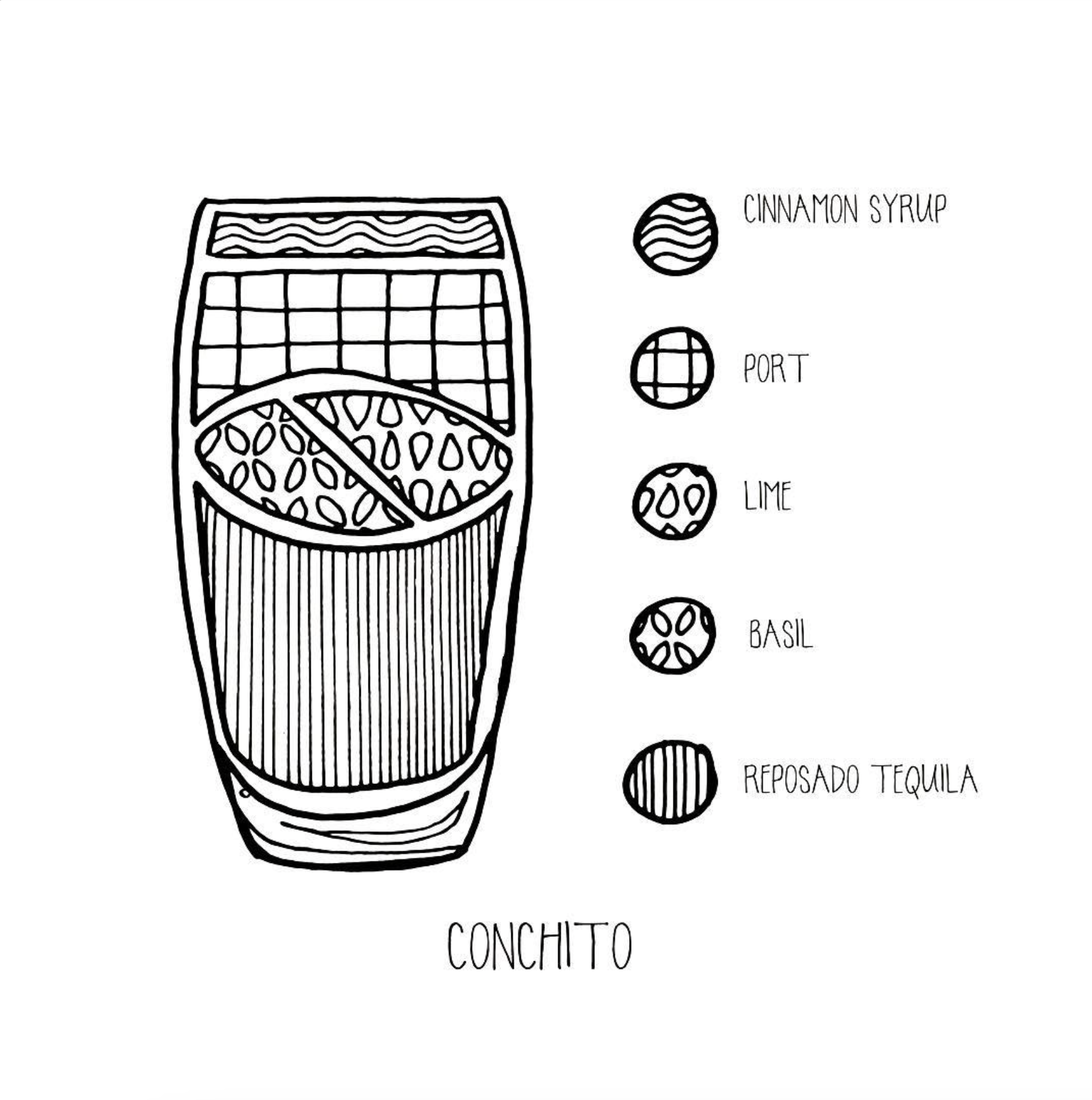
In removing the labels from the drawing itself, David and his team were freed up to swap in ingredients depending on seasonality, or new recipes, without requiring a full re-do of an illustration. I created 16 versions of the illustrations, varying the number of ingredients, glass shape, and designs within. In the nine years Padrecito was open, I only had to create one additional illustration for them, despite sometimes weekly changes to the menu, a testament to the strength of the design language created.